Jan 2019 - Sep 2022
Jan - Apr 2019
Since the early days of the product there were few standards in place. The app was getting increasingly inconsistent. This drift continued even two years after refreshing the brand identity. I led the initiative to create the first design system for the Omnisend app. My goal was to enable faster and more consistent product development, simplify the user experience, and unify the brand.
•
As the only designer at an early-stage startup, I managed design across the entire product, including research, UI/UX, branding. This workload left little time for the design system.
•
Meanwhile, the product was not only massive; it was also a Frankenstein.
•
Although the company supported it, the design system was a lower priority than new features.
•
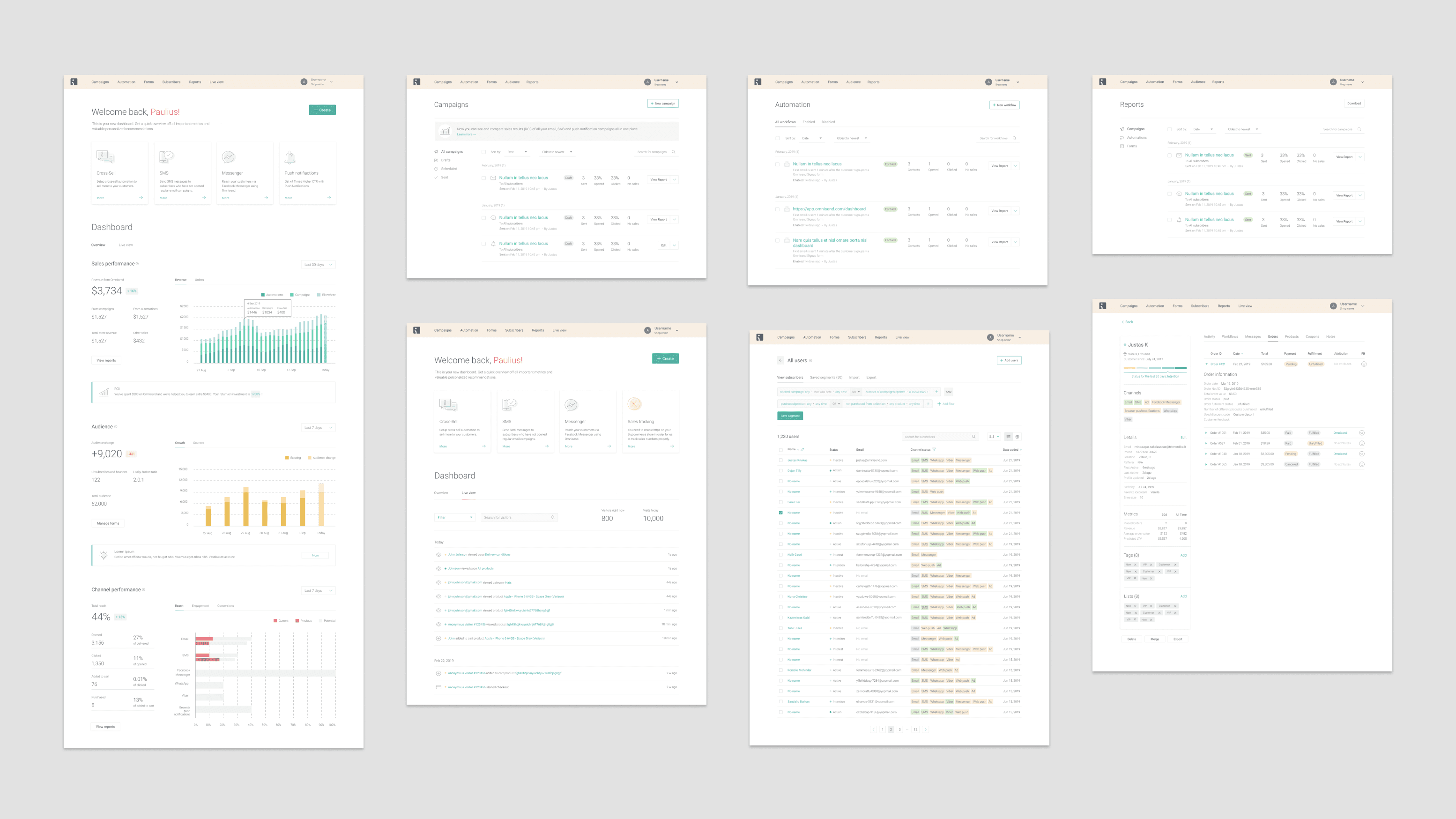
Due to lack of resources, we decided to implement the design system initially on new views planned for introduction, requiring me to simultaneously create the system and design new features.
Expecting an earlier start, I initiated a UI design audit one year prior to the actual creation of the design system. I defined key components like color, type, buttons, and spacing. This not only speeded up my daily work but also laid a foundation for the future design system.
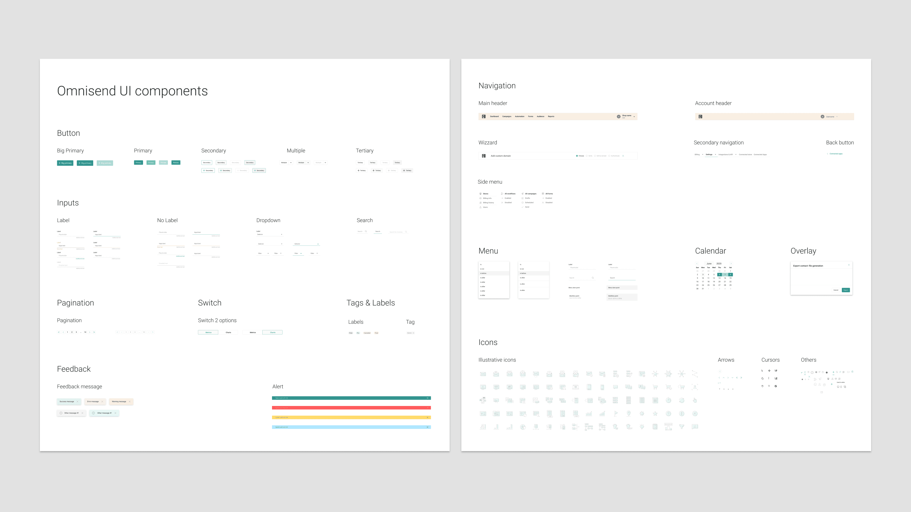
After refining the color scheme and typography, I drafted most views before development to see my new style guide in context. Collaborating with developers, we defined a list of necessary components, referring to systems like Bootstrap and Material Design. Iteratively adjusting components, we progressed from basics to complex elements like modals and wizards, and then entire views.
We agreed to gradually recreate the entire app in future releases, rebuilding corresponding parts when introducing new features. To increase awareness and encourage adoption, I also delivered a presentation on the new design system for the company.
•
Around 20% of the initial app was built using components from the design system, while the rest received minor updates in colors and fonts.
•
Despite imperfections, design system offered a better approach to building the product and maintaining design integrity.
•
This project shifted my approach from working in isolation to collaborating with engineers.
•
Rebuilding the app with new code and design components improved overall performance and increased user reliability and trust.
May 2020 - Jan 2021
As the company rapidly grew, a whole design department was formed. There was a need for a new, well-defined design system. As a Senior Product Designer, I led and contributed to the UI audit, research, guidelines, and component recreation, collaborating with designers, management, and developers.
The previous design system failed to reflect the current product state. I didn’t manage to establish working process to constantly review and update it. This caused ad hoc fixes, one-off solutions, and divergent styles.
With company growth, we took the chance to upgrade the system. This time we wanted to design our design system that felt collaborative and could support autonomy of multiple product teams.
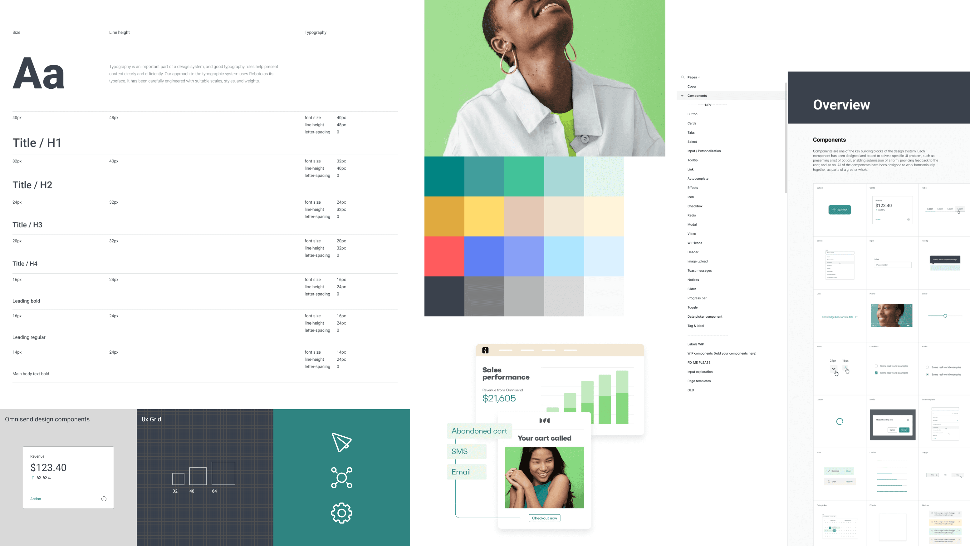
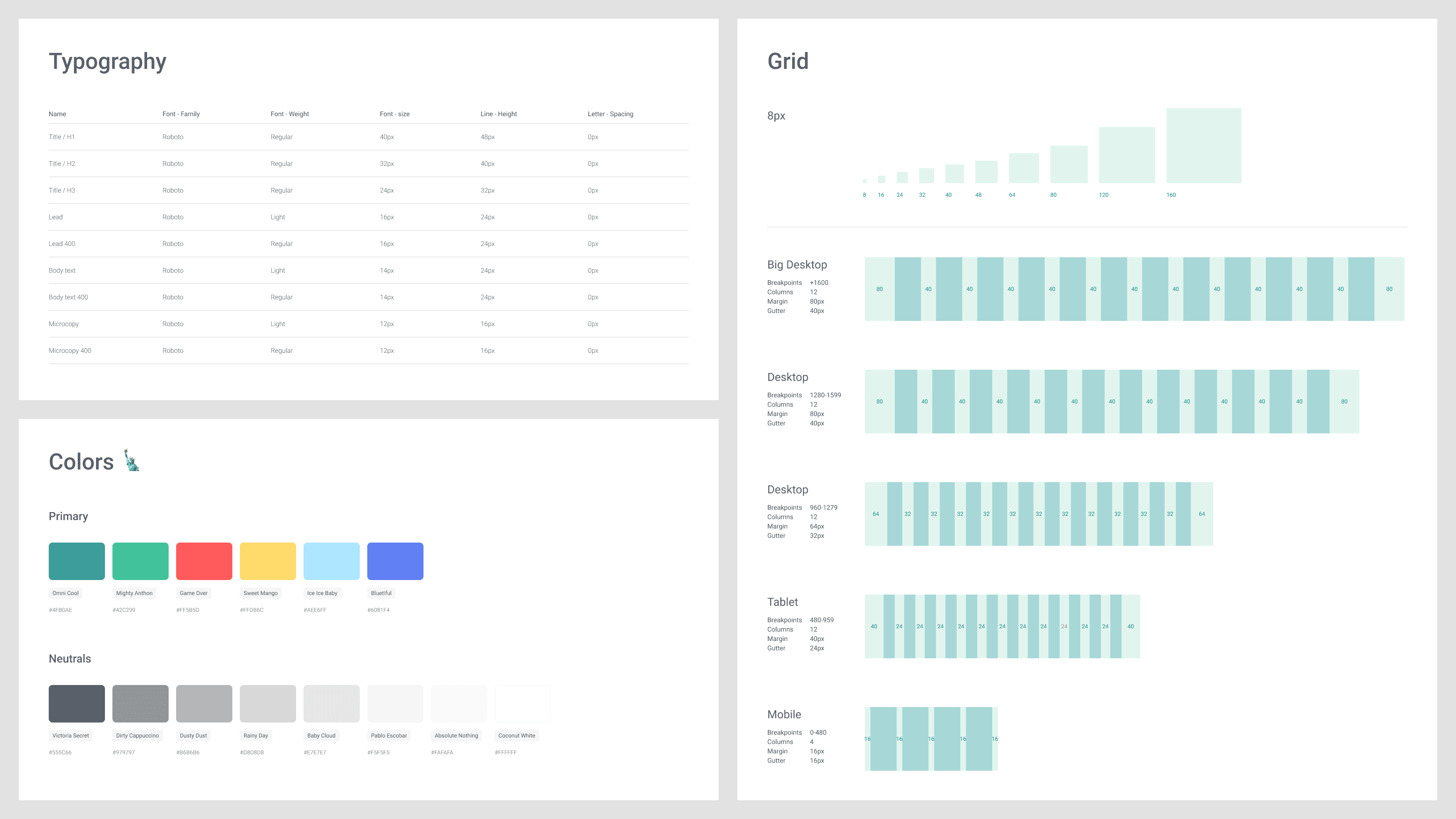
We started by refining base elements like typography, spacing and colors. To align our design team better, we worked on those components collectively. After auditing, analyzing and ideating on base design tokens, we merged excessive variations leaving only essentials.
After collectively establishing the design system foundation, we individually tackled assigned components. I prioritized user feedback and usability, addressing areas for improvement. For example, the previously designed input, inspired by Material design, caused significant usability issues as users struggled to identify it as an input
Despite the size and complexity, all components underwent the following stages:
1.
Audit of component instances and use cases throughout the app
2.
Ideation and design
3.
Collective review to ensure alignment on decisions
4.
Documentation and specs for developers
5.
Component development, including adding missing interactions and iteration if needed
6.
Testing
7.
Integration into Figma file and the code library in Storybook.
This project involved various roles, fostering awareness and ownership across the company. Without a dedicated maintenance team, all product teams agreed to contribute and maintain the design system. Despite not being ideal, the system supported large-scale growth, allowing teams to focus on concepts and experiences, rather than paddings, colors and type choices. While we achieved our goal, there were areas for improvement.
Documentation
Initially, the team designing and building the system relied heavily on meetings, but as new people joined, the importance of communication and documentation became evident. Lacking up-to-date documentation led to confusion that could have been avoided.
One-off project
I wish we treated the design system more as a product itself. Having a dedicated team would have helped maintain consistency. Unfortunately, we couldn't convince the company to invest in this, leading to product teams eventually giving up on system maintenance.
This brings us to the last part of this saga of design systems.
Jun - Sep 2022
In early 2022, Omnisend's marketing team refreshed the brand with a new color palette and typeface. As a senior product designer I helped update the design system and align the product with latest branding, overseeing audits, typography, color schemes, and UI updates. I was working closely with fellow product designers, developers, marketing team and management.
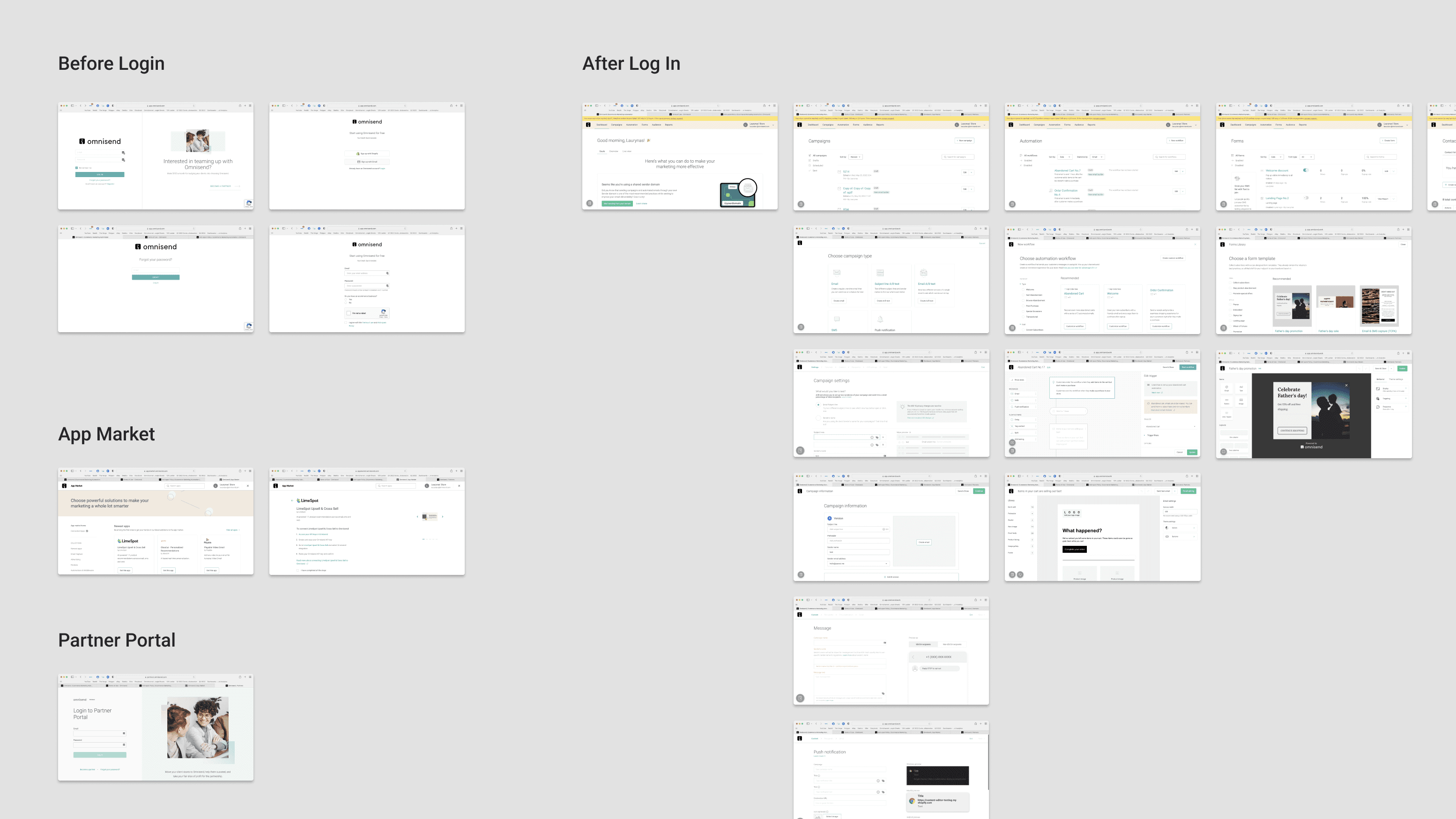
Our first task was to define the project's scope. We audited the app's current state, laying out main flows and views in Figma to understand the product's scale. Despite the temptation to redesign whole app, we agreed to focus on updating colors and fonts.
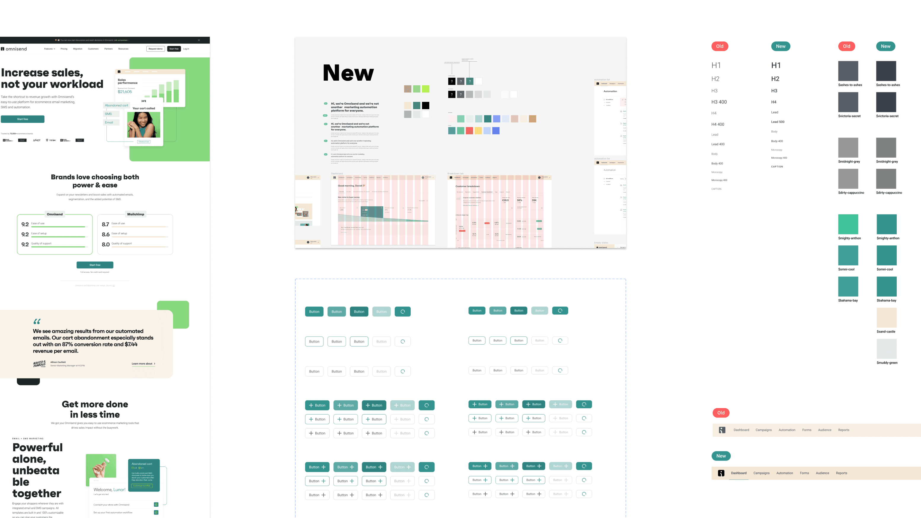
Omnisend's new brand, featuring bold display fonts and vibrant colors, was challenging to integrate into the app. After several workshops at design guild, we finally came up with a refined color scheme, typography, and visual changes. I was particularly pleased with the improved text styles and colors for better contrast.
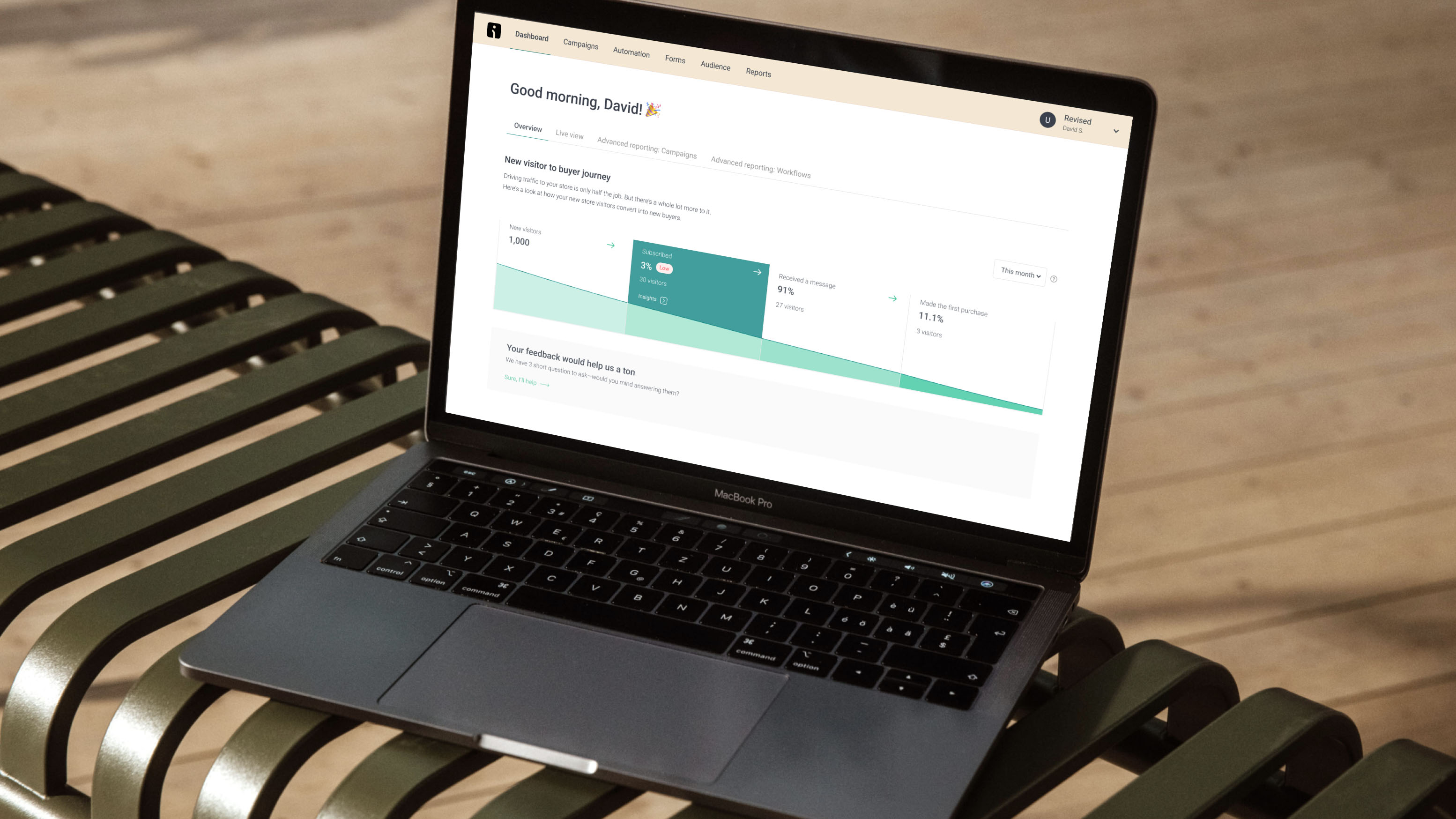
This update for Omnisend's design system and UI was smooth and effective. We prioritized cost-effective rebranding over a major redesign, making minimal yet impactful changes to the product's appearance. The use of solid code and design components proved to be an efficient way to refresh the product quickly.
Shaping Omnisend's design system has been quite a journey. As it’s visual language and strategy evolved, the design system had to change too. A unified design system is crucial for better and faster development—better because a cohesive experience is more user-friendly, and faster because it provides a common language. To be effective, the design system must fit the company's characteristics and be tailored to its needs. In our case, this meant dealing with a large product, while having a small team and limited resources.

